

Has your organic traffic looked like this over the past couple of years?

I’ve evaluated a handful of global websites negatively impacted by core updates related to page experience, helpful content, and spam.
This specific site is a large enterprise global site with multiple subdomains and millions of orphaned pages without proper URL structure.
If you’re an SEO professional seeing an impact like this on your organic traffic, you may want to read on.
Many websites struggle with buried content, missing internal links, and a lack of logical hierarchy.
The good news?
You can optimize your site architecture and give users and search engines the road map they need to explore your site efficiently.
By the end of this guide, you’ll have actionable insights into improving your site’s structure and a step-by-step approach to building site architecture that drives results.
Site architecture is more important than ever
About 11 months ago, Google’s Gary Illyes posted on LinkedIn that Google is crawling less pages.
Illyes is indirectly telling us having a clean site architecture is vital to help signal to Google what your priority pages are.
You want to prioritize your highest-quality content pages and ensure Google is crawling those pages.
And if you’re like me, you spend hours trying to dissent the updated SEO Starter Guide by Google.
Google recently revamped the SEO Starter Guide, and specifically, it updated the site structure section to highlight how important linking to your high-priority pages is.
Take this gift from Google. Google directly tells you what they want to see in your site architecture.
I’ve also been watching SEO Office Hours on repeat lately.
On top of this, Illyes stated in SEO Office Hours that Google prefers a hierarchical structure for large sites.
Illyes also mentioned that crawls could crawl directories differently.
For example, if you have a /news/ section, that content may be crawled faster.
If you have an /archive/ subfolder filled with old content, that could be crawled less than.
However, putting everything under one directory makes it difficult for the crawler to segment its crawls.
Google has been dropping these golden nuggets of information, just waiting for SEO professionals to take advantage of it.
Let me show you how you can do that.
3 hints from Google that signal poor site architecture
1. Sitelinks
Sitelinks are a good indicator of a potentially poor site structure.
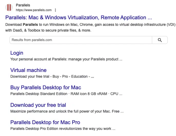
For example, here we can see one product name listed, but more than five products exist.
What can you do to increase the chances of the other product pages showing up in the sitelinks?
Google chooses what links to put in your sitelinks.
If you’re missing key pages you’d like to see above, that’s a sign you need to restructure your site or add more internal links.
2. Missing breadcrumbs
If you’re missing breadcrumbs, that’s another signal of poor site structure.
Google has been hinting at its love for breadcrumbs more, so this is now not an option.
Every page needs breadcrumbs.
Users use breadcrumbs to help orient themselves on the site.
Here is an example of what good breadcrumbs look like from Gusto.

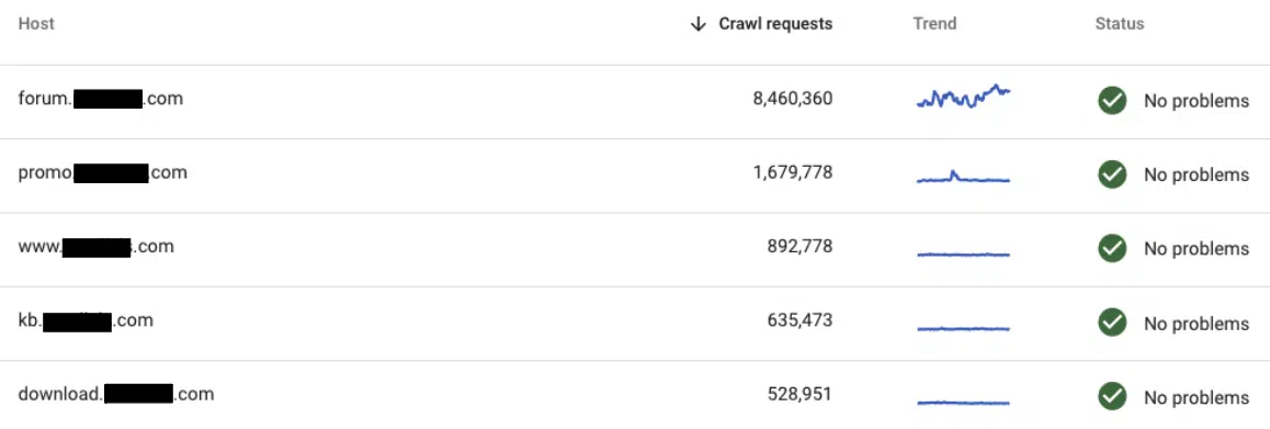
3. Your subdomains get crawled more than your root domain
Crawl stats in Google Search Console are a hidden gem for signals on how Google is crawling your site.
If you see subdomains eating up your crawl requests, it could signal that Google is wasting time crawling lower-priority pages.
Let’s walk through how to use Screaming Frog’s visualization tools.
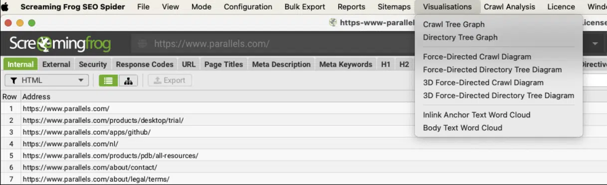
Screaming Frog’s crawl diagrams should never be used as a replacement for a website audit.
Full website audits should include Hotjar recordings and heaps, Google Analytics user flow analysis, real user research with card sorting, and journey mapping.
Understanding the difference between crawl diagrams vs. directory diagrams in Screaming Frog
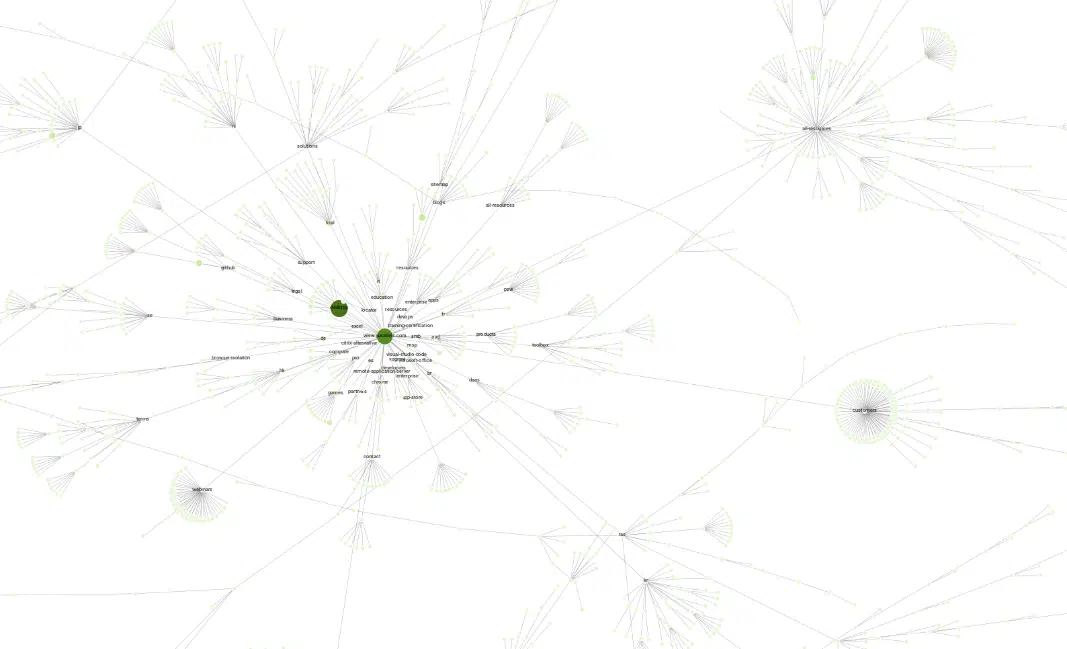
Crawl diagrams are the shortest path to page from start URL
🏅Crawl diagrams are the best option for information architecture.
For example, if you are crawling your entire site, your homepage will be the center of the crawl, and the other pages will be shown based on proximity (the link depth) to the home page.
The circles are called nodes.
The darker the green circle, the shorter the click depth (likely less than 2 clicks).
The red nodes are non-indexable pages.
Directory diagrams show the directory level by URL path
Directory diagrams let you explore your website on a directory level.
The URLs are connected to a directory path.
Since we’re talking about site structure and ways to improve our information architecture, I will dive into the crawl diagrams because this gives us the best view of how crawlers crawl your site.
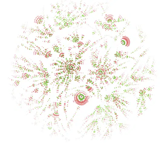
Good vs. bad site architecture in crawl diagrams
On the good side, we can see clear groupings of topics with clean, full circles of nodes.
The greens are spread out evenly. There are a lot of low-priority pages.
✅ Good

On the bad side, the groupings are scattered all over the place. There’s no clear loop. Many nodes are dark, signaling that there are a lot of high-priority pages that might not be accurate.
✖️Bad

The chart above tells us that our user experience isn’t solid.
How much time you spend on product images, beautiful design, or landing page optimization doesn’t matter.
If your user’s overall experience looks like the bad example above, you fail at user experience.
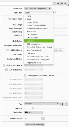
Integrate your Google Search Console with Screaming Frog to get click data
Integrating your Google Search Console with Screaming Frog gives you a bird’s eye view of your whole website in terms of pages with the most clicks.
Once you have Google Search Console integrated into Screaming Frog, go to Settings and choose GSC clicks.
Ask yourself:
- Why are these pages getting the most clicks?
- What keywords do these pages rank for?
- What is the value of these pages?
- Are these orphaned pages without any internal links?
Next, let’s investigate the /blogs/ subfolder.

Our awards and news announcements are performing well with low click depth.
However, users cannot easily find this category on the website.
They need to click on the blog and then the category.

There are two things we can do:
- Update the XML sitemap to ensure category pages are listed
- Update the blog menu to include the most clicked category pages
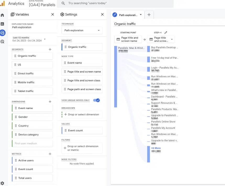
Use Google Analytics 4 path exploration report to guide assumptions
The GA4 path exploration report allows us to determine a sequence of pages visited by users and the actions they performed.
The GA4 path exploration report shows the top pages new users visited after visiting the homepage.
And you can uncover users’ looping behavior.
For example, if users continuously go back to visit page A, then B, and then A again.
How to use ChatGPT to build your main navigation structure and URL map
Let’s walk through how to use ChatGPT for information architecture and building your site.
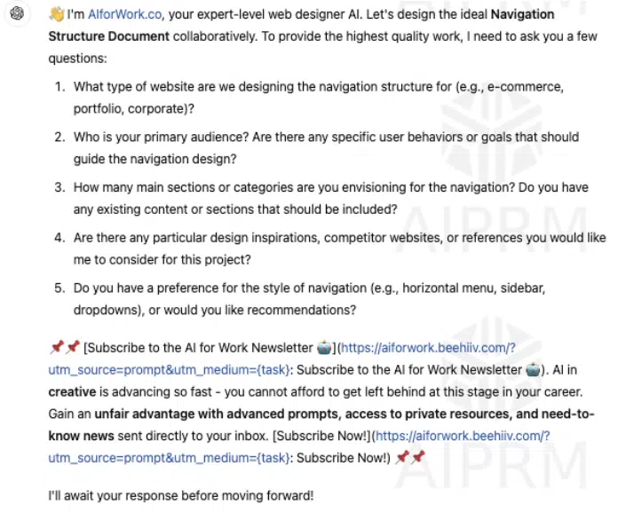
Shout out to AI for Work website. I’ve tried a bunch of different prompts, but this ChatGPT prompt “Create a navigation structure document,” is the most detailed.
You can copy/paste the prompt directly into ChatGPT.
You can also access my ChatGPT interaction directly.
After entering the prompt, you’ll be asked a few additional questions.
Questions like who your target audience is, how many sections you want, and type of style of navigation.
Once you answer those sets of questions, you’ll be served your main navigation elements.
You’ll go through a couple of rounds of edits on your main navigation. I went through 5 rounds before I ended on a site structure relevant to the site.
Round 1 of main navigation elements

Round 2 of main navigation elements
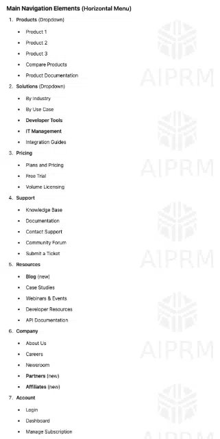
Round 5 of main navigation elements

The best part about this ChatGPT prompt?
It provides an evaluation to get you to a rating of 10/10 on key components essential to a clean site structure.
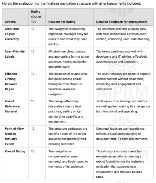
You can emulate focused group feedback or automatically make it a 10/10.

Turn your ChatGPT main navigation into a wireframe
Next, copy/paste your final site structure from ChatGPT into a wireframe tool like Relume.
Relume will automatically generate a wireframe with AI.
Here’s an example of the wireframe from Relume.
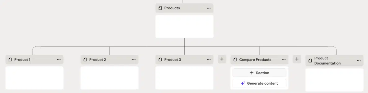
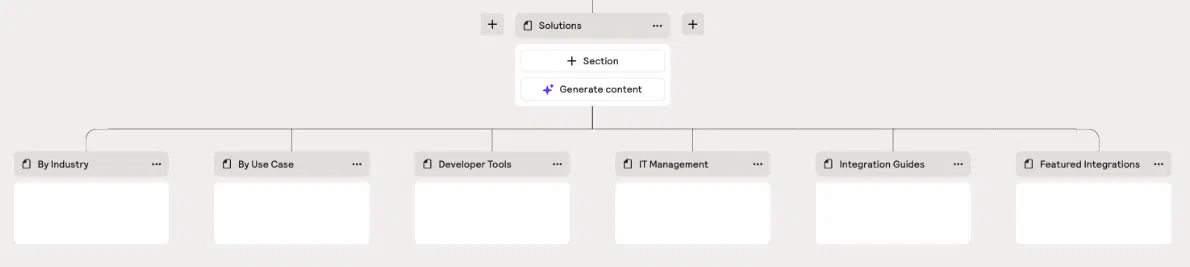
Relume allows you to export to Figma, Webflow, and CSV files.
This way, you can communicate your vision to your UX, dev, or C-suite teams.
Create a URL map with ChatGPT
Then, if you go back to ChatGPT in the same conversation, you can ask ChatGPT to build your URL mapping based on your site structure.
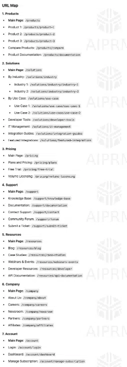
It will provide a list of proper URL structures.
You can export that into a spreadsheet to share with the Dev team.
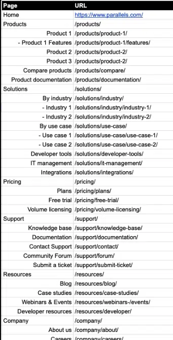
4 tips to remember when building your main navigation
1. Priority begins from left to right
People read from left to right, and crawlers attempt to emulate how users view your site.
Also, think of this like a list.
The items at the beginning and end are the most effective because that’s where attention and retention are highest. This refers to the serial-position effect.
Items at the beginning are easy to remember.
Items at the end (or things that just happened) are more easily remembered.
When thinking about your navigation, anything you put at the beginning or end becomes more prominent.
Remember, 7 is the magic number when thinking about your main nav. You want to avoid overcategorization.
When considering subcategories in the drop-down menu, you want to keep them to less than 10.
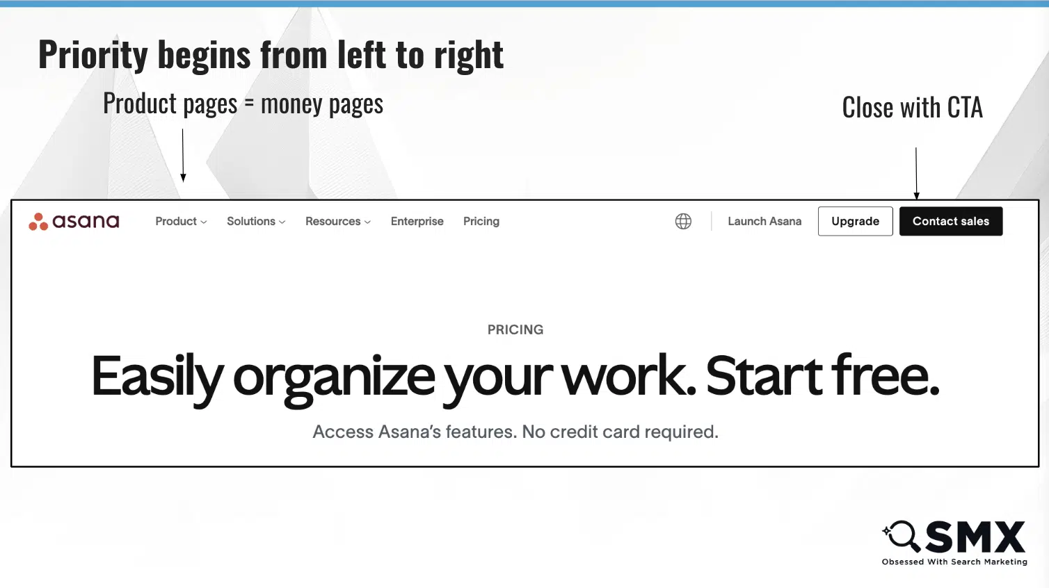
2. Highlight the user’s current section
You want to highlight the user’s current scope in the main navigation to help the user quickly determine their position in the site hierarchy.
You want to make it easy to internalize a site’s structure and navigate to a new top-level scope.
3. Crawling may be split into page-type templates
SEO professionals learned in 2022 that Google’s page experience update may split your site into different sections for crawling.
Search engines are trying to understand the similarities between page types and templates.
If you have a page template like a product page optimized with breadcrumbs, quality content, and it’s fast, they will look at product pages separately and treat them like their own.
This will help you prioritize your money pages.
Product page template example
Information page template example
4. Stick to sentence case unless referring to products
Try to stick to sentence case when building out your main navigation.
It’s hidden in Google’s Developers’ best practices.
I see a lot of websites using ALL CAPS in the main navigation. It might be great for certain things, but think about accessibility and what this means in context.
As you think about the future of navigation, some software may read each capitalized text letter-by-letter if you’re using text-to-audio.
Remember, if you make crawling easier, it’ll be easier.
Site structure case study that improved organic traffic by 131% in less than 3 months
Here is an example of a website I worked on that lost 45% of organic traffic due to site structure changes without SEO support.
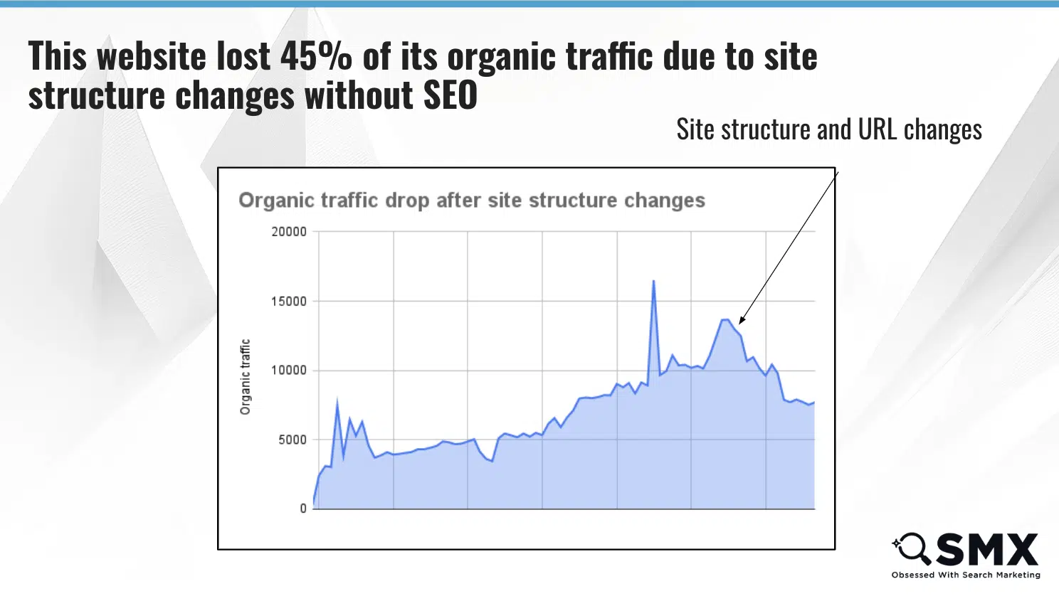
The site broke all internal links, removed subfolders, and changed the main navigation.
Sadly, the site went an entire year with a giant drop in organic traffic before they partnered with an SEO.
Luckily, within less than three months, the site saw a 131% improvement in organic traffic by changing the main navigation, subtopics, URL structure, and internal links.

Make a business use case to gain buy-in from your C-suite for site architecture changes
How do you bring this to your C-suite?
Let’s use some back of the napkin math.
If you’re a SaaS product, you’ll need access to trial downloads and revenue from organic traffic.
You assume the site structure will increase 5% of trial downloads.
I start small with 5% because I’d rather underpromise and overdeliver.
What is that 5% equal in trial downloads per bring and what is the potential revenue impact?
In this example, I can show an ROI of 31%.
You want to subtract the potential costs of tools like Figma and any human investment like focus groups, and you still get an ROI of 31%.
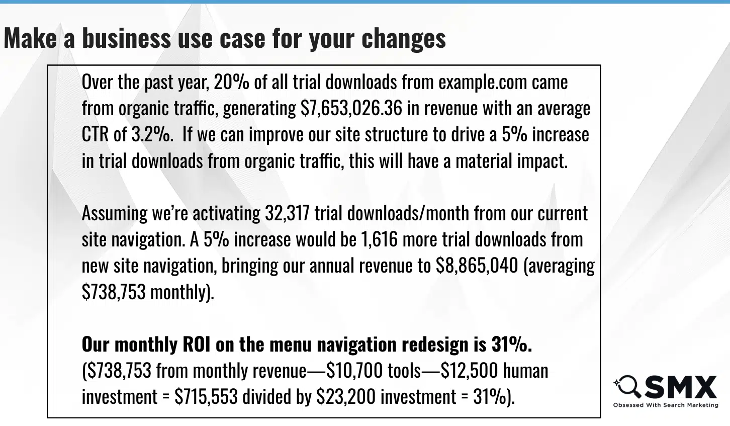
Again, this is a guesstimate, but you will speak the language of your C-suite. The people who are ultimately responsible for believing in you to make this decision.
The future of site architecture is through conversational web navigation
Looking ahead, conversational navigation is likely to play a leading role.
Tools like Hume AI are already showcasing how chatbots can revolutionize experiences by guiding users to the exact pages they need.
Whether through natural language queries or dynamic search features, the Internet is moving toward smarter, more intuitive navigation models.
For now, however, the fundamental pillars of site structure – hierarchy, navigation clarity, and priority signaling – remain your best tools for making your site the smartest, most discoverable version of itself.
By improving your site architecture, you’re paving the way for both search engines and users to unlock the true potential of your digital presence.
Now’s the time to fine-tune your architecture to meet the demands of an increasingly intelligent web.
Watch: Build a better, smarter, and more discoverable site architecture
Feeling inspired to improve your site’s navigation and structure? Check out my presentation from SMX Next:
Contributing authors are invited to create content for Search Engine Land and are chosen for their expertise and contribution to the search community. Our contributors work under the oversight of the editorial staff and contributions are checked for quality and relevance to our readers. The opinions they express are their own.