Nothing
Phone
2a
Plus:
Two-minute
review
Nothing
has
already
confirmed
that
its
next
flagship
smartphone
–
the
Nothing
Phone
3
–
won’t
be
making
its
debut
until
2025,
but
that
doesn’t
mean
fans
of
the
brand
aren’t
without
new
phones
to
get
excited
about
in
the
meantime.
In
March,
we
were
introduced
to
the
Nothing
Phone
2a:
a
device
with
all
the
sensibilities
of
the
current
top-tier
Nothing
Phone
2,
but
with
more
modest
hardware
and
a
price
tag
to
match.
It
did
well
–
very
well
in
fact,
becoming
the
brand’s
best-selling
smartphone
to
date,
and
proving
that
a
market
exists
for
the
company’s
distinct
design
aesthetics
and
forward-looking
user
experience
in
a
more
affordable
package.
It’s
this
success
(and
the
long
wait
for
another
flagship
phone
from
the
company)
that
likely
led
to
the
creation
of
the
Nothing
Phone
2a
Plus:
a
new
variant
of
the
2a,
announced
only
four
months
after
the
original’s
arrival.
(Image
credit:
Future
|
Alex
Walker-Todd)
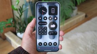
The
2a
Plus
is
much
the
same
phone
as
its
namesake,
but
rather
than
being
a
larger-screened
version
of
the
2a,
the
‘Plus’
in
this
instance
actually
refers
to
the
slight
uplift
in
performance,
camera
hardware,
and
battery
tech
boasted
by
this
refreshed
model
over
the
standard
iteration;
although
it
does
also
come
with
a
price
increase
to
match.
On
sale
from
September
10
for
$50
/
£50
/
AU$40
more
than
the
equivalent
storage
capacity
Phone
2a,
the
2a
Plus
remains
mostly
unchanged;
with
the
same
transparent
polycarbonate-backed
design
(this
time
with
extra
metallic
detailing),
the
same
strong
6.7-inch
120Hz
AMOLED
display,
the
same
rear
cameras,
same
battery
capacity,
and
same
software
promise.
The
higher
asking
price
buys
you,
among
other
things,
a
beefier
Dimensity
7350
Pro
chip,
which
delivers
on
the
promised
benchmarks
of
10%
better
CPU
performance
and
30%
greater
graphical
performance,
compared
to
the
more
modest
MediaTek
chip
powering
the
standard
Phone
2a.
You
also
get
50W
charging,
compared
to
45W
on
the
2a
that’s
–
as
you
might
expect
–
fractionally
quicker
(a
full
charge
takes
just
under,
compared
to
just
over,
an
hour),
and
a
new
higher-resolution
50MP
front
camera
(compared
to
a
32MP
snapper
on
the
2a),
which
serves
up
more
detail;
not
to
mention
the
Plus
boasts
a
richer
shooting
experience,
thanks
to
a
new
AI-supported
‘Vivid’
mode.
All
in
all,
the
question
is
not
whether
Phone
2a
users
have
been
short-changed
and
if
there’s
any
point
in
upgrading
(there
isn’t).
Instead,
the
Nothing
Phone
2a
Plus
edges
the
needle
closer
to
the
performance
of
the
company’s
current
flagship
(especially
graphically)
for
a
lot
less,
whereas
we
saw
the
standard
model
as
more
of
an
improvement
on
the
original
Nothing
Phone
1,
as
you’ll
read
in
our
original
Nothing
Phone
2a
review.
You
still
pay
a
premium
for
that
Nothing
aesthetic
and
unique
Glyph
lighting,
though,
meaning
similarly-priced
rivals
offer
more
in
areas
like
software
support,
faster
charging,
or
a
superior
viewing
experience,
but
at
the
expense
of
the
sense
of
style
that
Nothing
has
cultivated
with
its
products.
Nothing
Phone
2a
Plus
review:
Price
and
availability

(Image
credit:
Future
|
Alex
Walker-Todd)
-
Priced
at
$399
/
£399
/
AU$639 -
On
sale
from
September
10,
2024 -
US
availability
via
Nothing
Beta
Program
The
Nothing
Phone
2a
Plus
comes
in
a
sole
12GB
RAM
/
256GB
storage
variant,
which
means,
in
most
markets,
it
comes
in
at
a
single
price
(you
can
get
it
with
8GB
or
12GB
of
RAM
in
India).
In
Nothing’s
homeland
of
the
UK,
the
phone
costs
£399
(direct
from
Nothing),
£50
more
than
the
original
asking
price
of
an
equivalent
256GB
standard
Phone
2a.
Even
in
the
short
months
since
the
standard
2a
debuted,
however,
the
company
has
already
officially
cut
its
price
in
key
markets.
A
256GB
2a
costs
£329
at
the
time
of
writing,
meaning
you
actually
pay
£70
more
for
the
Plus
today.
to
scroll
horizontally
|
Header Cell – Column 0 |
Nothing Phone 2a Plus |
Nothing Phone 2a |
Nothing Phone 2 |
|---|---|---|---|
| 128GB | N/A |
N/A / £319 / AU$529 |
$599 / £579 / AU$1,049 |
| 256GB |
$399 / £399 / AU$639 |
$349 / £349 / AU$599 |
$699 / £699 / AU$1,149 |
| 512GB | N/A | N/A |
$799 / £699 / AU$1,249 |
The
assumption
is
that
the
Phone
2a
will
remain
on
sale
until
Nothing
runs
out
of
stock,
at
which
point
the
2a
Plus
will
be
the
company’s
sole
mid-ranger
(the
newer
phone
should
also
come
with
a
price
reduction
of
its
own
by
that
point).
In
the
US,
as
with
the
Phone
2a,
the
2a
Plus
is
currently
only
available
through
the
company’s
Beta
Program.
Despite
being
competitively
priced
in
the
market,
there
are
caveats
to
purchasing
this
phone
in
the
region;
namely
a
significantly
shorter
14-day
return
period
and
–
as
the
devices
being
sold
are
international
models
–
incomplete
support
for
US
carrier
bands
(i.e.
spotty
cellular
connectivity
with
major
US
networks).
If,
like
the
Phone
2,
Nothing
decides
to
launch
the
2a
Plus
Stateside
officially,
the
model
sold
will
feature
more
complete
US
carrier
support,
but
the
company
hasn’t
announced
any
such
plans
at
the
time
of
writing.
-
Value
score:
4
/
5
Nothing
Phone
2a
Plus
review:
Specs
to
scroll
horizontally
|
Row 0 – Cell 1 | |
| Dimensions: |
161.7 x 76.3 x 8.5mm |
| Weight: | 190g |
| Display: |
6.7-inch 1084 x 2412 30-120Hz AMOLED |
| Chipset: |
MediaTek Dimensity 7350 Pro |
| RAM: |
8GB / 12GB |
| Storage: | 256GB |
|
OS (at launch): |
Android 14 |
|
Primary camera: |
50MP, f/1.88, 84.5° FoV, 1/1.57-inch sensor w/ OIS |
|
Ultra-wide camera: |
50MP, f/2.2, 114º FoV, 1/2.76-inch sensor |
|
Front Camera: |
50MP, f/2.2, 81.2º FoV, 1/2.76-inch sensor |
| Battery: | 5,000mAh |
| Charging: |
50W wired |
| Colors: |
Black, Grey |
Nothing
Phone
2a
Plus
review:
Design
(Image
credit:
Future
|
Alex
Walker-Todd)
-
Iconic
Nothing
aesthetic -
IP54-certified
polycarbonate
body -
Repels
scuffs
well
but
back
attracts
smudges
While
the
Phone
2a
marked
a
slight
departure
from
the
company’s
previous
smartphones,
with
its
main
dual
camera
placed
transversely
along
the
center
line
of
the
phone’s
back,
rather
than
being
offset
in
the
corner,
it
otherwise
carried
across
all
the
hallmarks
of
the
Nothing’s
now-established
design
language.
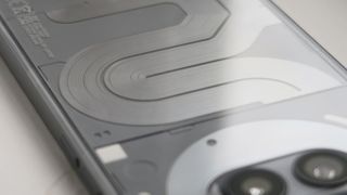
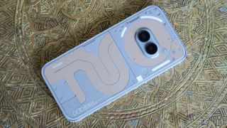
The
Phone
2a
Plus
echoes
the
standard
model’s
dimensions,
weight,
and
aesthetic
identically;
there’s
a
transparent
polycarbonate
back,
under
which
you’ll
find
tracks
of
faux
circuitry,
a
cluster
of
diffused
LEDs
around
the
camera,
which
make
up
the
phone’s
Glyph
Interface,
and
a
matte
plastic
frame,
with
a
power
button
set
into
the
right
side
and
large
volume
up
and
down
keys
along
the
left
edge.
It’s
in
the
color
department
where
Nothing
has
set
the
2a
and
2a
Plus
apart
visually.
While
the
standard
phone
arrived
in
black
or
Milk
(white)
–
both
variants
also
sported
a
red
accent
–
the
2a
Plus
can
be
bought
in
either
Black
or
Grey,
with
that
circuitry
no
longer
color-matching
the
bodywork,
and
instead
sporting
a
more
eye-catching
reflective
silver
finish.
It’s
a
simple
and
effective
way
to
distinguish
the
Plus
from
the
standard
2a,
and
it
feels
a
little
more
premium,
too.
However,
I
do
miss
the
cleaner
look
of
both
launch
finishes
of
the
standard
2a
(especially
Milk).
In
the
hand,
the
proportions
and
weight
of
the
2a
Plus
make
it
a
surprisingly
comfortable
phone
to
use
one-handed.
For
its
size,
it
feels
beautifully
put
together,
especially
for
a
device
that
is,
externally,
mostly
polycarbonate.
Scuffs
and
scrapes
are
repelled
surprisingly
well;
I
just
wish
it
didn’t
hold
onto
smudges
so
readily.
Nothing
goes
into
some
detail
on
the
stress
testing
the
2a
line
is
subjected
to,
for
peace
of
mind,
but
the
build
is
also
independently
certified
against
dust
and
water
ingress
with
an
IP54
rating;
not
quite
as
advanced
as
high-end
devices,
but
perfectly
at
home
for
use
in
wet
weather
and
the
like.
-
Design
score:
4
/
5
Nothing
Phone
2a
Plus
review:
Display
(Image
credit:
Future
|
Alex
Walker-Todd)
-
6.7-inch
120Hz
Full
HD+
OLED -
Protected
by
Gorilla
Glass
5 -
Sluggish
in-display
optical
fingerprint
sensor
Sticking
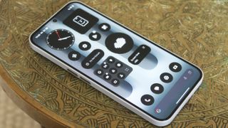
with
aesthetics,
Nothing’s
love
for
flexible
OLED
panels
grants
the
Phone
2a
Plus
balanced
bezels
around
its
flat
6.7-inch
Full
HD+
(1084
x
2412)
screen;
framing
things
neatly
with
a
91.65%
screen-to-body
ratio
(for
comparison,
the
pricier
Galaxy
A55
sports
a
86.9%
ratio).
The
display
is
protected
by
both
a
factory-fitted
screen
protector
and
Gorilla
Glass
5
(i.e.
not
Corning’s
latest
and
greatest,
but
respectable
in
terms
of
both
impact
and
scratch
protection),
and
after
several
weeks
of
use,
my
device
only
picked
up
one
or
two
superficial
abrasions.
That
upgraded
front-facing
camera
sits
neatly
at
the
center
of
the
panel’s
top
edge,
while
an
optical
under-display
fingerprint
sensor
hangs
down
near
the
bottom
bezel.
Practically,
I
think
the
sensor
placement
is
a
little
too
low,
and,
surprisingly,
the
response
time
of
this
particular
fingerprint
reader
is
well
behind
what
I’ve
come
to
expect
from
the
technology.
We’re
talking
milliseconds
here,
but
I
hope
Nothing
works
to
improve
read
speed
via
subsequent
updates,
as
it
lags
behind
the
quality
of
the
rest
of
the
experience
served
up
by
the
2a
Plus.
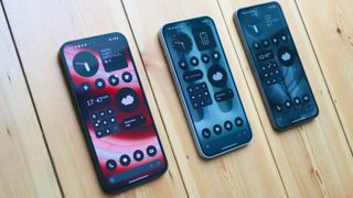
The
Phone
2a
(left),
Phone
2a
Plus
(center)
and
Phone
2
(right)
(Image
credit:
Future
|
Alex
Walker-Todd)
As
for
the
panel
itself,
it’s
the
same
screen
found
on
the
standard
2a,
with
nice
colors,
contrast,
and
a
respectable
1,100-nit
average
maximum
brightness (with
a
1,300-nit
peak).
Other
reviewers
have
reported
fractionally
better
brightness
scores
from
the
panel
on
the
2a
Plus,
compared
to
the
2a,
but
anecdotally
I
never
saw
a
noticeable
difference
while
testing
them
side
by
side;
both
are
visible
in
bright
conditions,
even
if
there
is
plenty
of
room
for
improvement.
While
the
use
of
OLED
tech
ensures
nice
vibrant
colors
and
deep
blacks,
the
2a
Plus
doesn’t
pack
LTPO
tech,
meaning
the
120Hz
refresh
can
step
down
to
30Hz,
but
no
lower,
and
in
fairly
sizable
increments,
too.
In
practice,
the
OS
tends
to
err
on
the
side
of
fluidity,
even
if
that
means
higher
power
consumption
(you
do
have
the
ability
to
cap
it
at
60Hz
manually,
if
you
prefer).
Nothing
doesn’t
grant
a
huge
amount
of
control
over
customizing
the
viewing
experience,
beyond
including
always-on
display
(AoD)
support
and
Night
Light
(which
warms
display
color
temperature
when
it’s
dark
or
late).
You
have
Alive
or
Standard
color
profiles
to
choose
between,
with
a
warm-to-cool
slider,
too,
but
again,
while
appreciated,
this
is
a
comparatively
bare-bones
take
on
display
personalization,
compared
to
what
you’d
find
on
equivalent
Xiaomi.
-
Display
score:
3.5
/
5
Nothing
Phone
2a
Plus
review:
Software
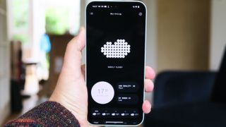
Nothing
OS’
stylized
weather
app
(Image
credit:
Future
|
Alex
Walker-Todd)
-
3
years
of
OS
&
4
years
security
updates -
Launches
with
Nothing
OS
2.6
atop
Android
14 -
Nothing
AI
news
widget
is
novel
but
has
provenance
issues
Nothing
OS
fast
found
a
home
among
fans,
thanks
to
its
distinct,
minimalist
aesthetic,
monochrome
icon
and
widget
theming,
and
as
the
means
of
interaction
with
the
defining
functional
design
feature
of
the
brand’s
phones:
the
Glyph
Interface.
Since
the
original
Nothing
Phone,
the
company
has
continued
to
build
out
this
experience
with
new
functionality,
without
straying
from
the
path;
ensuring
a
consistent
experience
across
all
its
devices
at
all
price
points
(from
the
top-tier
Phone
2,
down
to
the
recently
released
affordable
CMF
Phone
1).
Like
the
standard
Phone
2a,
the
2a
Plus
arrives
on
Android
14
but
sports
the
latest
(at
the
time
of
writing)
Nothing
OS
2.6.
The
experience
is
as
great
as
every
other
Nothing
Phone,
with
the
look
and
feel
being
one
of
its
major
draws.
It’s
really
nice
to
use,
slick,
and
responsive
on
the
2a
Plus
thanks
to
that
high
refresh
rate
display.
The
ability
to
have
supersized
folders
and
app
icons
is
a
nice,
unique
bit
of
personalization
and
the
native
widgets
are
oozing
with
the
dot
matrix
charm
that
embodies
Nothing
OS’
visual
style.

The
new
News
widget,
introduced
in
Nothing
OS
2.6
(Image
credit:
Future
|
Alex
Walker-Todd)
One
of
the
most
interesting
additions
in
Nothing
OS
2.6
is
a
new
news
widget.
Add
it
to
your
home
screen
and
select
as
many
topics
as
you
like
from
a
shortlist
of
seven
during
the
initial
setup
screen
(these
include
business,
entertainment,
sports,
technology,
and
more).
Once
set
up,
tap
the
widget
each
day
to
hear
an
impressively
convincing
AI-generated
version
of
Nothing’s
CFO
Tim
Holbrow
read
out
various
stories,
covering
your
chosen
topics.
It’s
a
novel
and
convenient
way
to
digest
current
affairs,
and
a
meaningful
implementation
of
free
AI
functionality
that
few
other
mid-rangers
come
close
to
offering.
There
are,
however,
some
obvious
drawbacks.
For
one,
you
have
no
idea
about
the
provenance
of
the
stories
being
read
out.
Even
during
setup,
the
widget
never
cites
its
sources,
and
there’s
no
way
to
dive
deeper
or
access
the
source
material
on
a
story
Tim
just
read
to
you.
There’s
the
obvious
risk
of
AI
hallucination
to
consider
with
a
tool
like
this,
too,
not
to
mention
the
ethical
quandary
of
fair
attribution
to
the
journalists
whose
work
this
widget
has
scraped
for
content.
While
I
like
the
method
of
delivery,
here’s
hoping
subsequent
updates
iron
out
at
least
some
of
the
pitfalls
with
this
otherwise
capable
news
widget.
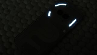
The
2a
Plus’
Glyph
Interface
lit
up
in
darkness
(Image
credit:
Future
|
Alex
Walker-Todd)
Despite
its
lower
standing
in
Nothing’s
smartphone
portfolio,
the
2a
Plus
doesn’t
lose
out
on
the
brand’s
signature
Glyph
Interface
–
the
diffused
LED
segments
around
the
phone’s
rear
camera.
There
are
far
fewer
than
on
the
Phone
2,
but
the
trio
that
are
present
still
fulfill
all
the
same
functions:
as
visual
indicators
for
incoming
calls
and
notifications
when
the
phone
is
face
down,
to
represent
timers
and
ETAs
on
supported
apps,
and
as
a
softer
fill
light
when
shooting
video.
You
can
also
create
your
own
Glyph
patterns
by
downloading
Nothing’s
Glyph
Composer
app,
which
is
a
fun
bonus.
While
not
everyone
will
appreciate
a
phone
that
flashes
(you
can
disable
it
if
you
don’t
like
the
Glyphs
at
all),
it’s
another
novel
and
aesthetic-defining
characteristic
of
Nothing’s
phones
and
I
appreciate
its
presence;
although
I
wish
more
third-party
developers
put
it
to
use,
as
it
doesn’t
feel
like
it’s
being
utilized
to
its
full
potential.
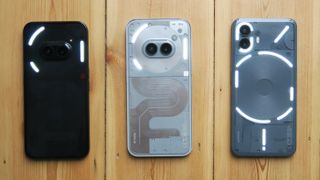
The
Glyph
Interfaces
on
the
Nothing
Phone
2a
(left),
Phone
2a
Plus
(center)
and
Phone
2
(right)
(Image
credit:
Future
|
Alex
Walker-Todd)
When
it
comes
to
software
updates,
Nothing
is
great
at
constantly
pushing
fixes
and
features
to
its
devices;
it’s
far
more
prolific
than
bigger
brands
like
Motorola
or
Sony,
and
they
should
take
note,
as
it
constantly
feels
like
your
phone
is
improving.
Nothing’s
also
great
at
granting
its
users
early
access
to
Android
betas,
ahead
of
each
OS’
full
release,
which
right
now
means
you
can
technically
already
get
your
hands
on
Android
15,
if
you’re
willing
to
hazard
its
unfinished
state.
The
flip
side
is
that
software
promises
have
become
increasingly
competitive
in
the
market,
with
Apple
and,
more
recently,
the
likes
of
OnePlus,
Samsung
and
Google
pushing
for
five,
six
or
even
seven
years
of
support
on
its
latest
devices.
In
the
case
of
the
Phone
2a
Plus,
the
promise
of
three
years
of
OS
updates
and
four
years
of
security
updates
seems
acceptable
for
the
phone’s
mid-range
standing,
but
looks
like
a
much
weaker
proposition
on
the
more
expensive
Phone
2.
If
Nothing
has
the
resources,
being
able
to
up
those
numbers
would
keep
it
competitive.
-
Software
score:
4
/
5
Nothing
Phone
2a
Plus
review:
Camera
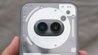
(Image
credit:
Future
|
Alex
Walker-Todd)
-
Same
dual
50MP
rear
sensors
as
Phone
2a -
Upgraded
50MP
front
camera -
New
Vivid
Mode
with
real
time
analysis
The
Phone
2a’s
distinct
rear
dual
50MP
sensors
(a
Samsung
GN9
for
the
main
sensor
and
a
Samsung
JN1
for
the
ultra-wide)
remain
unchanged
from
the
standard
Phone
2a,
as
does
the
Imagiq
765
ISP
(image
signal
processor)
handling
things
behind
the
scenes;
despite
the
change
in
silicon
between
the
two
phones.
The
more
prominent
difference
is
the
upgraded
front
camera,
which
sees
the
2a’s
32MP
snapper
traded
for
another
50MP
JN1
(yes,
the
same
sensor
used
by
the
ultra-wide).
The
result
is
higher-resolution
selfies
with
a
different
capture
profile
and
the
ability
to
shoot
4K
video
on
the
phone’s
front,
too.
Nothing
Phone
2a
Plus
camera
samples
Side
by
side,
selfies
taken
on
the
2a
Plus
display
greater
detail
and
dynamic
range
in
well-lit
scenes.
However,
the
fact
that
shots
are
captured
at
50MP
natively,
and
not
pixel-binned,
means
blurring
and
detail
loss
in
low
light
conditions
is
prevalent.
Portrait
shooting
across
the
front
and
back
sensors
can
be
hit
and
miss,
too,
with
edge
detection
from
the
Portrait
Optimizer
within
Nothing’s
TrueLens
Engine
(i.e.
its
camera
software)
tripping
up
from
time
to
time.
Otherwise,
results
are
good.
Another
camera
addition
that
remains
unique
to
the
Phone
2a
Plus
is
Vivid
Mode;
not
even
the
Phone
2
running
the
same
version
of
Nothing
OS
has
this
feature,
at
the
time
of
writing.
Not
only
does
Vivid
Mode
change
the
color
science
employed
to
achieve
more
saturated
shots,
but
it
also
uses
AI
to
analyze
what’s
in-frame
and
serves
up
real-time
insight
into
what
it’s
actually
doing.
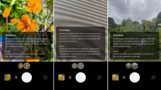
Within
Vivid
Mode,
the
‘result’
section
grants
real-time
AI-generated
insight
into
how
the
camera
is
processing
whatever’s
in
frame.
(Image
credit:
Future
|
Alex
Walker-Todd)
It’s
another
novel
use
of
AI,
but
one
that
shows
Nothing
is
thinking
about
new
ways
to
enhance
the
mobile
photography
experience
and
also
give
the
user
more
insight
into
how
to
compose
shots
and
what
to
consider.
Vivid
Mode
lends
itself
well
to
further
improving
low-light
shots,
too.
-
Camera
score:
3.5
/
5
Nothing
Phone
2a
Plus
review:
Performance
(Image
credit:
Future
|
Alex
Walker-Todd)
-
3nm
MediaTek
Dimensity
7350
Pro
chipset -
8GB
/
12GB
RAM
w/
RAM
Booster
up
to
20GB -
Sole
256GB
storage
variant
(non-expandable)
One
of
the
three
tentpole
upgrades
–
and
perhaps
the
most
significant
–
that
the
2a
Plus
lords
over
the
standard
2a
is
a
new
chipset.
MediaTek
has
once
again
supplied
Nothing
with
an
exclusive
variant
of
its
mobile
silicon
variant,
which
promises
a
10%
CPU
uptick
and
up
to
a
30%
graphical
performance
boost,
compared
to
the
Dimensity
7200
Pro
that
powers
the
vanilla
Phone
2a.
In
practice,
my
benchmark
results
suggest
more
modest
improvements
(about
3.5%
better
in
CPU,
6%
in
AI,
and
12%
in
GPU
performance).
That
said,
this
doesn’t
detract
from
the
fact
that
this
Dimensity
7350
Pro-powered
phone
is
more
capable
outright;
scoring
closely
to
the
original
Phone
1,
as
well
as
more
recent
rivals,
like
Samsung’s
Galaxy
A35
and
Galaxy
A54,
along
with
the
Tensor
G2-powered
Google’s
Pixel
7
line.
By
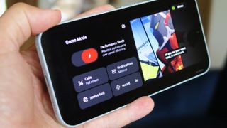
default,
high-fidelity
3D
titles
like
Zenless
Zone
Zero
default
to
‘low’
graphical
settings
at
30fps
and
deliver
perfectly
consistent
performance
at
that
level.
If
you
want
to
dial
things
up
to
‘high’
at
60fps,
though,
the
7350
Pro
seems
happy
to
be
pushed
in
short
bursts;
you’ll
just
start
to
notice
heat
build-up
(there
is
a
vapor
chamber
to
help
internal
cooling)
and
the
occasional
dropped
frame
after
about
20
to
30-minutes
of
play
time,
as
I
did.
Nothing
is
keeping
things
simple
with
a
single
256GB
(non-expandable)
storage
option
in
all
markets,
with
most
of
the
world
getting
12GB
of
RAM.
You
can
also
use
the
RAM
Booster
tech
in
Nothing
OS
to
allocate
some
of
that
storage
as
additional
memory
to
give
you
up
to
an
additional
8GB
of
virtual
RAM),
if
desired,
allowing
more
apps
to
remain
in
suspension
in
the
background.
Beyond
the
engine
of
the
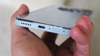
phone,
the
performance
of
its
asymmetrical
stereo
speaker
setup
also
surprised
and
impressed,
with
a
much
fuller
and
clearer
sound
than
you’d
expect
for
a
mid-ranger
such
as
the
Plus,
not
to
mention
some
usable
bass,
too.
-
Performance
score:
3.5
/
5
Nothing
Phone
2a
Plus
review:
Battery
(Image
credit:
Future
|
Alex
Walker-Todd)
-
5,000mAh
battery -
Fastest-charging
Nothing
Phone
yet,
at
50W -
7
hours
of
screen-on
time
per
charge
The
2a
Plus
is
tied
for
the
largest
battery
capacity
on
a
Nothing
Phone,
at
5,000mAh,
but
it
trumps
the
rest
of
the
range
–
including
the
Phone
2
and
2a
–
when
it
comes
to
fast
charging;
with
an
elevated
top
speed
of
50W.
While
we’re
not
approaching
OnePlus
or
Xiaomi
numbers
here,
50W
is
decently
fast
against
key
competitors;
so
fast,
in
fact,
that
Nothing’s
own-brand
charger
45W
can’t
refill
the
Phone
2a
Plus
at
full
speed.
For
that,
the
$39
/
£39
CMF
Power
65W
GaN
charger
is
the
next-best
thing;
especially
as
Nothing
doesn’t
include
a
power
adapter
in-box,
just
its
iconic
transparent-ended
USB-C
cable.
In
testing,
the
Phone
2a
Plus
reached
40%
charge
in
15
minutes,
over
70%
in
30,
and
a
full
charge
took
just
under
an
hour
(55
minutes).
As
you
might
expect,
with
only
a
5W
uptick
compared
to
the
standard
Phone
2a,
the
gains
in
fast-charging
are
limited;
the
base
2a
hit
30%
charge
in
15
minutes,
just
over
60%
in
30,
and
recharged
completely
in
just
over
an
hour,
under
the
same
conditions
as
the
Plus.
Screen-on
time
for
the
2a
Plus
is
respectable
at
7
hours
per
charge,
which
should
see
most
users
through
a
day
and
a
half
of
use
without
worry
(the
Phone
2a
offered
on
average
6
hours
and
45
minutes
of
screen-on
time).
For
added
peace
of
mind,
Nothing
also
states
that
even
after
1,000
charge
cycles,
the
2a
Plus’
battery
will
retain
90%
of
its
original
capacity,
which
is
well
above
the
kinds
of
figures
rivals
promise;
perhaps
even
an
industry-leading
claim.
-
Battery
score:
4
/
5
Should
you
buy
the
Nothing
Phone
2a
Plus?
to
scroll
horizontally
| Attributes | Notes | Rating |
|---|---|---|
| Value |
Just under the $400 / £400 threshold seems right for what the 2a Plus offers and how much competitors cost. |
4 / 5 |
| Design |
Iconic Nothing industrial design with extra flare, albeit rendered in polycarbonate top-to-toe. |
4 / 5 |
| Display |
A lovely viewing experience set within even bezels, but a surprisingly bad fingerprint sensor and limited customization hold it back. |
3.5 / 5 |
| Software |
A middling software commitment, but it’s hard to fault Nothing OS’ aesthetic and ease of use. That new News widget is divisive, though. |
4 / 5 |
| Camera |
A neat new AI trick here, higher-resolution selfies there, the Phone 2a Plus’ cameras are slightly flawed but, in places, surprise. |
3.5 / 5 |
| Performance |
The Dimensity 7350 Pro doesn’t deliver on the promised performance upgrades over the 2a’s chip, but it offers solid mid-range performance, regardless. |
3.5 / 5 |
| Battery |
The fastest charging Nothing phone to date, but only a fractional upgrade on the 2a, and still no wireless charging. |
4 / 5 |
Buy
it
if…
Don’t
buy
it
if…
Nothing
Phone
2a
Plus
review:
Also
consider
The
specific
blend
of
style
and
features
that
make
up
the
Nothing
Phone
2a
Plus
might
not
be
for
you
after
all.
If
that’s
the
case,
what
about
one
of
these
alternatives?
to
scroll
horizontally
|
Samsung Galaxy A35 |
Xiaomi Poco F6 |
Motorola Edge 50 Neo | |
|---|---|---|---|
|
Price (at launch): |
From $399.99 / £339 / AU$449 |
From £399 / €449.99 |
From £399.99 / AU$699 |
| Dimensions: |
161.7 x 78 x 8.2mm |
160.5 x 74.4 x 7.8mm |
154.1 x 71.2 x 8.6mm |
| Weight: | 209g | 179g | 171g |
|
OS (at launch): |
Android 14 |
Android 14 |
Android 14 |
| Display: |
6.6-inch Full HD+ 120Hz Super AMOLED |
6.67-inch (1220 x 2712) 120Hz CrystalRes Flow AMOLED |
6.4-inch (1256 x 2760) 120Hz LTPO P-OLED |
| Chipset: |
Samsung Exynos 1380 |
Qualcomm Snapdragon 8s Gen 3 |
MediaTek Dimensity 7300 |
| RAM: |
6GB, 8GB |
8GB, 12GB |
8GB, 12GB |
| Storage: |
128GB, 256GB |
256GB, 512GB |
256GB, 512GB |
|
Rear Cameras: |
50MP wide, 8MP ultra-wide, 5MP macro |
50MP wide, 8MP ultra-wide |
50MP wide, 13MP ultra-wide, 10MP 3x zoom |
|
Front camera: | 13MP | 20MP | 32MP |
| Battery: |
5,000mAh + 25W wired |
5,000mAh + 90W wired charging |
4,310mAh + 68W wired, 15W wireless |
How
I
tested
the
Nothing
Phone
2a
Plus
(Image
credit:
Future
|
Alex
Walker-Todd)
-
Review
test
period:
one
month -
Testing
included:
everyday
use
including
web
browsing,
social
media,
photography,
video
calling,
gaming,
streaming
video,
music
playback -
Tools
used:
Geekbench
6,
Geekbench
AI,
GFXBench,
native
Android
stats,
Samsung
65W
trio
charger
On
receiving
the
Nothing
Phone
2a
Plus,
I
also
picked
up
the
Phone
2
and
Phone
2a,
to
make
constant
comparisons
between
the
three
devices.
I
lived
and
worked
with
the
Phone
2a
Plus
for
a
month,
using
it
as
my
main
phone
for
everything
from
social
media
use
to
photography
and
gaming.
I
kept
track
of
battery
usage
each
day
and
ran
several
benchmark
apps
to
help
compare
performance
against
rival
devices
I
did
and
didn’t
have
to
hand.
As
a
reviewer
with
13
years
of
experience,
and
having
reviewed
previous
Nothing
phones,
I
felt
confident
assessing
and
scoring
the
Nothing
Phone
2a
Plus,
both
relative
to
other
mid-rangers,
and
in
the
context
of
the
wider
smartphone
market.
First
reviewed
September
2024

